The Power You Can Find in Your Color Wheel
23 May 2024
The problem and power of simultaneous contrast.
If you viewed the first post, you'll have seen the direct effects of Simultaneous Contrast.
Simultaneous contrast means that our eyes are always mixing colors. Whaaat? Even when we don't mix paints? Yes, it's true. The paint we put on the paper or canvas is subject to this function of the eye and brain.
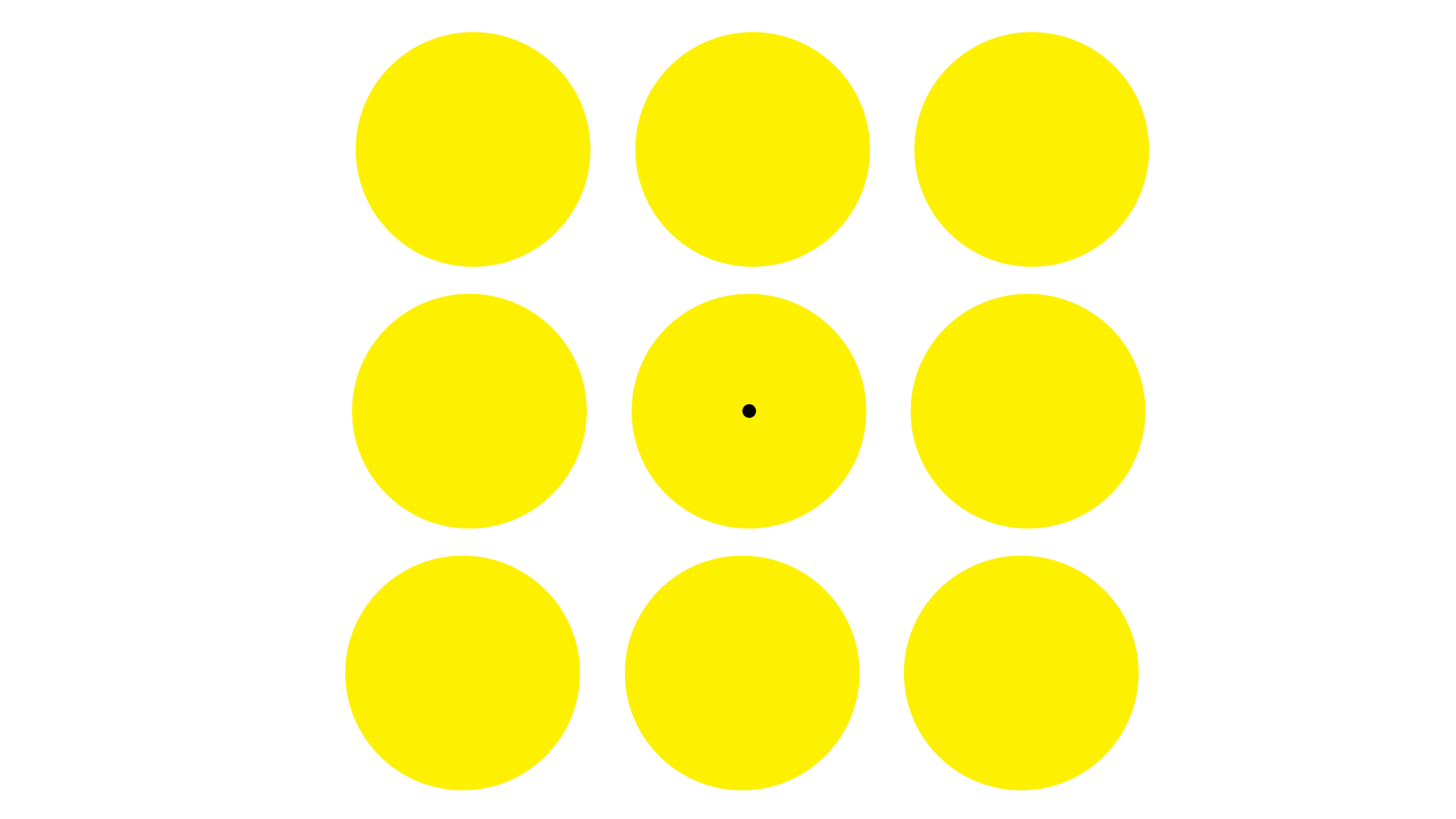
In the animated image exercise above, we see the complement of yellow (violet) in the afterimage. In truth, the violet is always there for us, because our eyes see a color's complement at the same time we see that color! So violet mixes a little with the yellow.
You can do this same exercise with any color. The more saturated the color, the more obvious is the effect. Any color will show us an afterimage of its complement on a color wheel. And each will mix a little with its complement on a color wheel.
What does this mean for the painter, you ask?
(Besides making us a little bit crazy?) Good question! It means that when we understand the way this visual function works, we gain power in the way we use color in our work.
Colors influence each other.
Simultaneous contrast is one influence. Color subtraction and additive color are two more influences colors have on themselves.
Have you ever had a painting turn into a muddy mess? Of course you have. We've all had that happen.
It's not a bad thing - it means we're working it. We hit a certain wall. But it's usually time to regroup, scrape or lift or let the paint dry, paint over it, move on. (Remember, it's only paint, no matter what medium you're working with.)
You can use any color model to back up and figure out what's going on. Or what's not going on.
I use the RGB model (red, green, blue) because it's planted deep within my brain since kindergarten. But you can use CMYK (cyan, magenta, yellow, black) or any other color model you're familiar with, and apply it to your canvas and palette. The theory will translate the same relationships.
But how do these influences work on your canvas or paper?
Another good question. In fact, I'm developing a whole course around this topic, but for now here's a tip to try:
Want your greens to be greener? Try adding some reds in and around the area. You can experiment with purply reds or orangey reds or right-in-the-middle reds. See what happens.
Below is an example of Color Subtraction. I resorted to adding red to get the greens to be more lively. I wanted the feeling of sunlight moving through green undergrowth. There were so many different layers and temperatures of greens at this location. But my painted greens kept flattening to an uninteresting mush no matter how I mixed them. No matter what colors or shades I used. I tried a scarlet, saturated red to make the lighter greens jump, and got much closer to the feeling I wanted. And I got more of the spatial depth that I wanted.

"Tree People: Through Sunlight Thickening", gouache on paper by Julia O'Reilly
So head into your studio! Or outdoors. Go paint. Experiment with color. See if you can puzzle out what colors are the main influencers. Carry a color-wheel with you and use it. Color influences are a visual problem. Solving for their operation in your painting is a combination of seeing and thinking. It takes practice. Lots of practice. Be patient. It will come.
Thanks for stopping by! If you have questions, you can contact me here.